
Front-End Development Trends in 2025: What Every Developer Should Know
27 August 2025
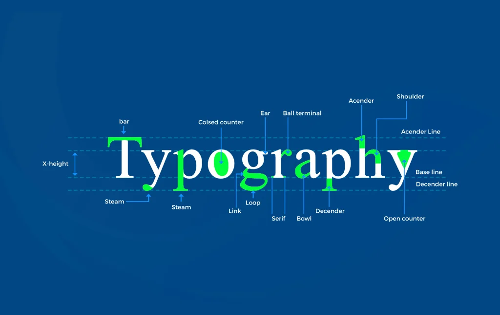
Typography is the backbone of UI, because 90% of what users see is text. The wrong choice makes even a great layout look unprofessional.
Core rules for UI typography:
- Font Hierarchy: Use different sizes/weights for headings, subheadings, and body text.
- Line Height & Spacing: Improve readability with enough breathing room.
- Consistency: Stick to 1–2 font families across the app.
- Scalability: Use relative units (rem, %) for responsive text.
Examples:
- A headline font (bold, large, modern like Inter or Poppins).
- A body font (clean, readable like Roboto, Open Sans).
Frameworks like Tailwind’s typography utilities or CSS clamp() make scalable typography easy for responsive design.

27 August 2025