
Front-End Development Trends in 2025: What Every Developer Should Know
27 August 2025
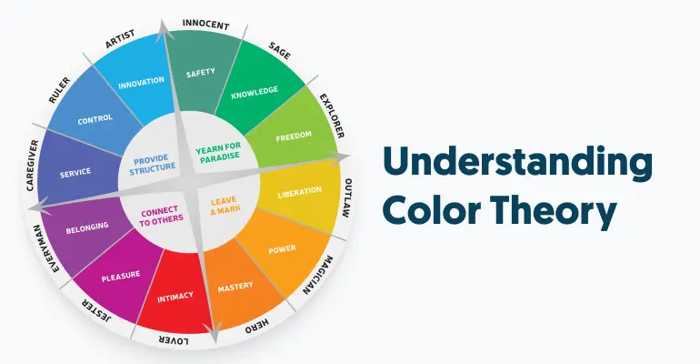
Color is one of the most powerful tools in UI. It doesn’t just make things pretty — it gives structure, hierarchy, and meaning.
Key aspects of using color in UI:
- Primary Colors: Define the brand identity (e.g., Facebook’s blue, YouTube’s red).
- Secondary Colors: Provide highlights and support visuals.
- Neutral Palette: Backgrounds, text, borders (grays, whites, blacks).
- Accent Colors: Used sparingly for buttons or alerts.
Best practices:
- Maintain contrast between text and background for readability.
- Use color meaning (red for errors, green for success).
- Limit the palette to 3–5 main colors for a clean design.
In modern design systems, tools like Tailwind CSS, Figma styles, or CSS variables help maintain consistency across projects.

27 August 2025